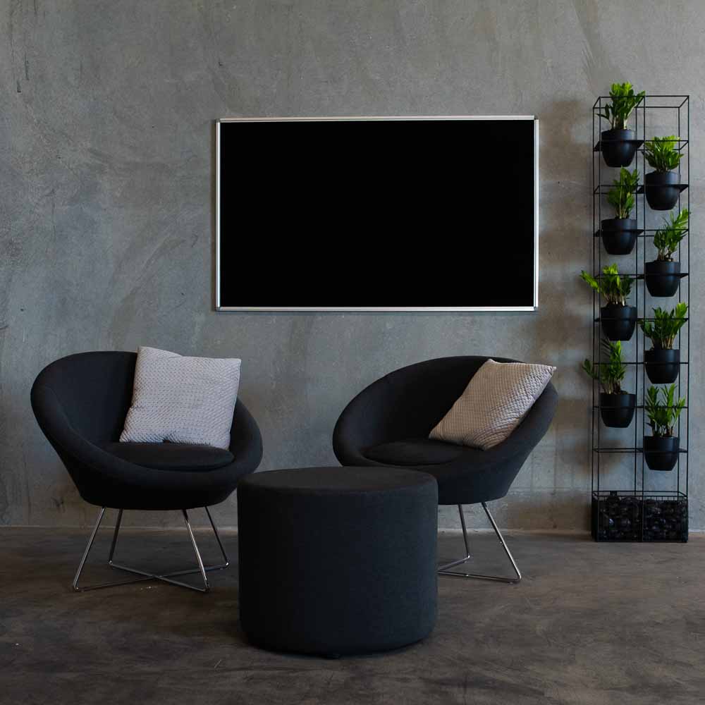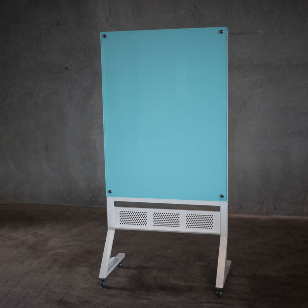
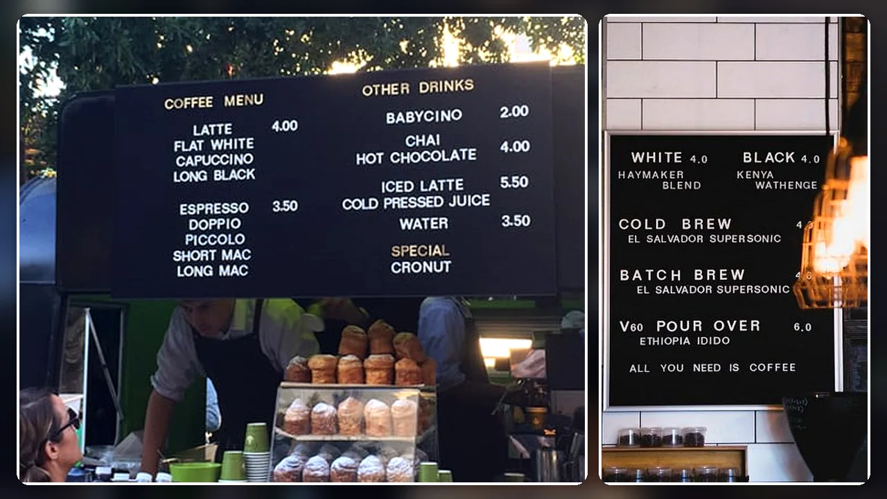
A menu board should make frequently changing information easy to update and easy for customers, visitors or staff to read. The right format depends on how often the content changes, the amount of information displayed, normal viewing distance and the visual style of the space.
A felt letter board is generally the strongest option when a café, restaurant, retail store or workplace needs neat, reusable text without rewriting the complete display by hand. A blackboard may suit handwritten menus and daily specials, while a framed display board is more appropriate for printed menus that change less frequently.
Before ordering, prepare the longest realistic version of the menu or message. This helps determine the required board size, orientation, character size and number of letter and number packs.
1. Define What the Menu Board Needs to Display
A commercial menu board may display:
• Product names
• Prices
• Food and beverage categories
• Daily specials
• Dietary information
• Service times
• Promotions
• Room or facility information
• Reception messages
• Event schedules
• Retail pricing
• School or workplace announcements
Separate essential information from optional detail.
A café board may need product names and prices but not full ingredient descriptions. A workplace information board may require only short headings, times and locations. Excessive content makes the display harder to update and reduces readability.
Write out the longest likely version of the content before choosing the board.
Include:
• The maximum number of menu items
• The longest product name
• Price formats
• Category headings
• Symbols and punctuation
• Temporary promotional messages
• Blank space between sections
• Future items that may be added
This draft becomes the basis for calculating board size and character requirements.
Buyers can compare available letter boards after defining the complete message rather than choosing from appearance alone.
2. Compare the Main Menu Board Types
Different menu display formats suit different update frequencies and presentation styles.
Felt Letter Boards
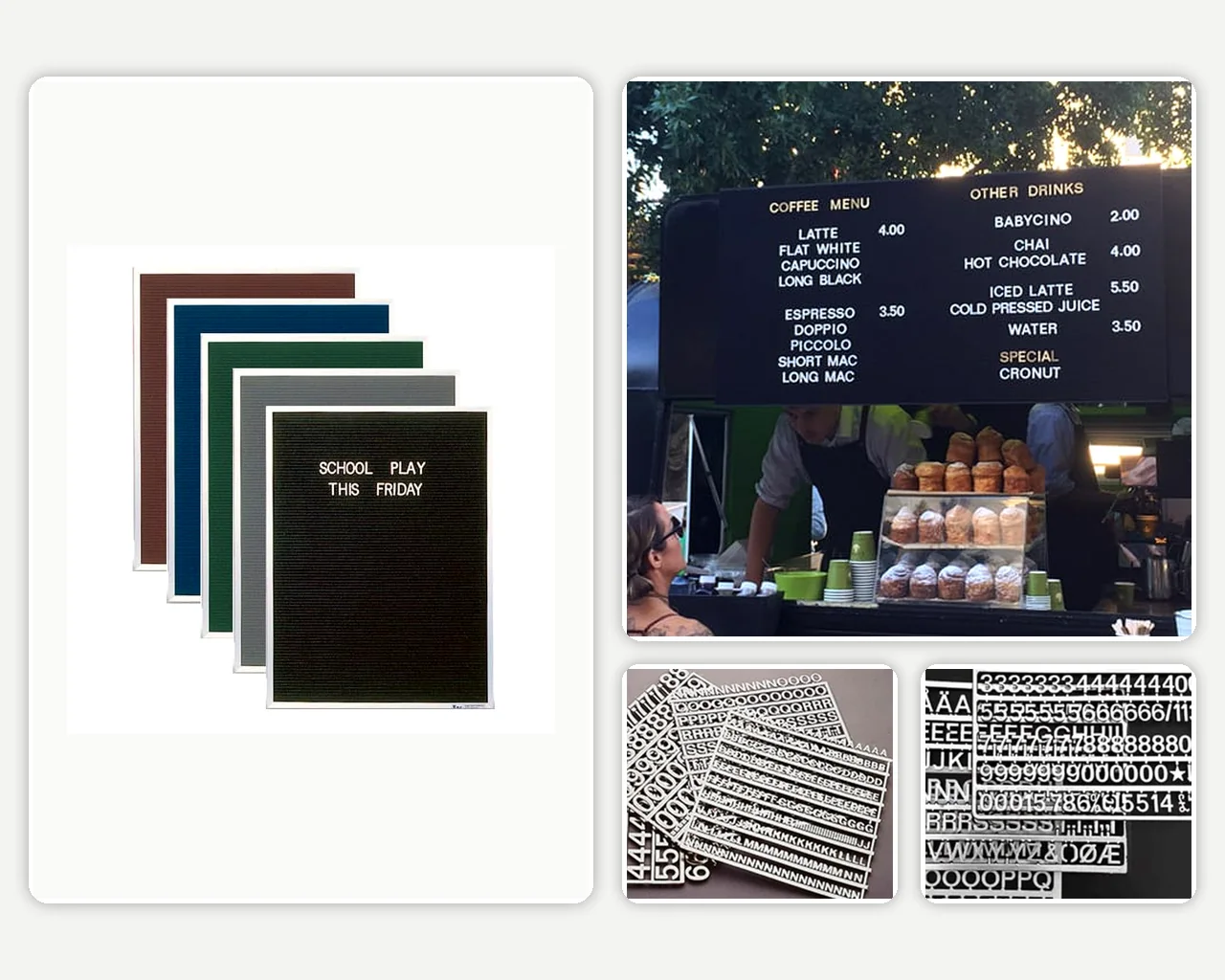
A felt letter board contains horizontal grooves that hold interchangeable plastic characters.
It provides:
• Consistent lettering
• Reusable messages
• Neat alignment
• Easy price changes
• Framed and frameless options
• Several surface colours
• Portrait and landscape formats
• Wall-mounted or freestanding use on selected products
Felt letter boards work particularly well for permanent locations where wording changes regularly but a uniform appearance is preferred.
Blackboards
Blackboards provide a flexible handwritten surface for:
• Daily specials
• Seasonal menus
• Promotional messages
• Illustrations
• Temporary pricing
• Event information
They can create a more informal or handcrafted presentation. Their effectiveness depends on clear handwriting, suitable chalk and regular cleaning.
The available blackboards may be more appropriate when staff want complete freedom over lettering, drawings and layout.
Whiteboards
A whiteboard can support menus and pricing where functionality is more important than front-of-house appearance.
Whiteboards are commonly better suited to:
• Staff areas
• Production schedules
• Catering preparation
• Internal pricing references
• Event coordination
• Temporary operational information
They allow fast updates but may appear less integrated with a hospitality or retail interior.
Printed Display Boards
A printed menu or poster inside a frame can provide a polished result when content changes infrequently.
This format suits:
• Permanent service information
• Opening hours
• Standard product lists
• Compliance notices
• Promotional posters
• Branded information
Printed inserts need to be redesigned and replaced when prices or items change. Buyers can compare display boards and cases where document protection or printed presentation is more important than character-by-character changes.
3. Choose a Felt Letter Board for Frequent Updates
Felt groove letter boards provide a useful balance between changeability and consistent presentation.
Plastic characters slide into evenly spaced grooves, allowing staff to update individual words or prices without rewriting the whole board.
This can be valuable for:
• Cafés with changing coffee or food menus
• Restaurants updating specials
• Bars changing drink selections
• Retail stores displaying pricing
• Reception areas changing welcome messages
• Schools posting event information
• Offices displaying schedules or announcements
• Market stalls with changing product availability
A felt menu board is most effective when updates are planned rather than improvised during busy service periods.
Keep a reference layout showing:
• Heading positions
• Standard category order
• Preferred spacing
• Price alignment
• Character sizes
• Common symbols
• Approved abbreviations
The Executive Frameless Letter Board is available in several standard sizes, portrait or landscape orientation and multiple felt colours. Its grooved surface is designed for compatible interchangeable letters and numbers.
4. Calculate the Required Number of Lines
Board size should be based on usable lines rather than overall dimensions alone.
Start by listing every line the finished display requires.
For example:
• One main heading
• Three category headings
• Twelve menu items
• Twelve prices
• One promotional message
• Blank lines between categories
A menu with twelve products may therefore require considerably more than twelve horizontal lines.
Allow space for:
• Headings
• Product descriptions
• Prices
• Category separation
• Decorative spacing
• Future additions
• Temporary specials
• Empty margins around the content
Trying to fill every available groove can make the display difficult to scan.
A practical planning method is:
- Write the complete menu in its intended order.
- Assign one line to each heading and item.
- Add blank lines between major sections.
- Estimate how many characters each line requires.
- Test the arrangement at the intended character size.
- Increase the board size when lines or words appear crowded.
A larger board with controlled spacing usually reads more clearly than a smaller board filled edge to edge.
5. Choose Character Size Based on Viewing Distance
Letter size affects both readability and how much content fits on the board.
Smaller characters allow more information but are harder to read from a distance. Larger letters improve visibility but reduce the number of words that fit on each line.
Current Executive letter and number packs are offered in 15mm, 19mm and 28mm sizes. Confirm current product options and compatibility before ordering.
Smaller Characters
Smaller letters can suit:
• Countertop menus
• Reception messages viewed closely
• Detailed product lists
• Boards positioned beside a queue
• Compact workplace notices
They provide greater content capacity but should not be used where customers need to read the board across a large room.
Medium Characters
Medium-sized letters can provide a practical balance for:
• Wall-mounted café menus
• Small restaurants
• Retail pricing boards
• Reception displays
• Office announcements
Larger Characters
Larger characters are more appropriate for:
• Boards mounted high on a wall
• Menus viewed from a queue
• Larger hospitality venues
• Short category headings
• Directional messages
• Displays across wider rooms
Test a printed sample of the proposed character height from the furthest normal viewing position before placing the order.
6. Check Whether the Content Fits Horizontally
A line may fit vertically while still being too long for the board width.
Identify the longest likely entry, including its price.
Examples may include:
• A long product name
• A menu item with a description
• A multi-word workplace announcement
• A heading followed by operating times
• A promotional phrase
Decide whether the board will use:
• One column
• Two equal columns
• Category headings with prices aligned right
• Separate menu and drinks sections
• A narrow price column
• Several smaller content zones
Shortening product names can help, but abbreviations must remain clear to customers.
Avoid reducing the character size solely to accommodate one unusually long item. It may be better to:
• Use a second line
• Shorten the wording
• Increase the board width
• Split the menu into two sections
• Use more than one board
A full-scale paper or digital mock-up can reveal width problems before the board is manufactured.
7. Compare Framed and Frameless Letter Boards
The frame affects appearance, edge protection and how the board integrates with the surrounding interior.
Framed Letter Boards
A framed menu board provides a clearly defined border around the felt surface.
It can suit:
• Traditional cafés
• Schools
• Offices
• Staff areas
• Retail environments
• High-traffic locations
Potential advantages include:
• Protected board edges
• Defined visual boundary
• Familiar commercial presentation
• Straightforward coordination with other framed displays
• Clear separation from the wall finish
A silver aluminium frame provides a neutral commercial appearance. Frame colour and availability should be confirmed on the selected product.
Frameless Letter Boards
A frameless board provides a cleaner, more contemporary presentation.
It can suit:
• Modern cafés
• Restaurants
• Bars
• Boutique retailers
• Reception areas
• Design-led workplaces
• Larger feature menus
Frameless boards can appear integrated with the wall and may be installed individually or as part of a broader display.
The absence of a visible frame does not remove the need to measure carefully. Wall colour, surrounding joinery and the board’s edge position become more noticeable.
Choose framed when edge definition and a conventional commercial finish are priorities. Choose frameless when the board needs to blend into a modern interior or act as a larger feature.
8. Choose Portrait or Landscape Orientation
Orientation should follow the content layout and available wall space.
Landscape Menu Boards
Landscape orientation suits:
• Two-column menus
• Long product names
• Side-by-side food and drink sections
• Boards positioned above counters
• Wide feature walls
• Menus read from across a room
It generally provides greater horizontal capacity and can reduce the need to break long entries across several lines.
Portrait Menu Boards
Portrait orientation suits:
• Narrow wall sections
• Single-column menus
• Short product names
• Daily specials
• Reception directories
• Opening hours
• Vertical retail displays
A tall board can provide many lines but may place the upper or lower sections outside comfortable reach.
Check:
• Ceiling height
• Furniture beneath the board
• Mounting position
• Staff access for updates
• Customer sightlines
• Available width beside doors or windows
Select the orientation after preparing the content layout rather than rotating an existing design to fit an available wall.
9. Select a Felt Colour With Strong Contrast
Surface colour influences both readability and the overall appearance of the display.
Dark felt with light characters is commonly used because it creates strong contrast and a familiar menu-board presentation.
Available colours may include:
• Black
• Grey
• Royal blue
• Burgundy
• Emerald green
• Beige
• Other options depending on the product
Consider:
• Character colour
• Wall colour
• Interior finishes
• Lighting
• Brand colours
• Visibility of dust
• The amount of information displayed
• Future interior changes
Black or dark felt can provide strong contrast with white characters. Lighter felt may require black characters for equivalent readability.
Avoid selecting colour from a computer screen alone when precise matching is important. Digital displays, lighting and photography can change how the material appears.
Where possible, review a physical sample or confirm that the selected colour coordinates with the finished interior.
10. Decide Between Standard and Custom Sizes
A standard-size menu board is usually the simplest option where the content and wall space align with an existing product dimension.
A custom board may be worthwhile when:
• Standard sizes leave insufficient line capacity
• The board must fit between joinery or columns
• A long two-column menu is required
• The board must align with a counter
• Several boards need matching dimensions
• A feature-wall installation is planned
• The available wall has unusual proportions
• The project requires a specific portrait or landscape format
The custom frameless letterboard can be configured around non-standard dimensions where a listed size does not fit the intended space.
Before approving a custom size, provide:
• Exact width and height
• Orientation
• Wall photographs
• Surrounding furniture dimensions
• Proposed content layout
• Character size
• Mounting position
• Delivery access details
Custom sizing should solve a real layout problem. It should not be used as a substitute for simplifying an overcrowded menu.
11. Order Enough Letters, Numbers and Symbols
The board and character packs may be sold separately, so the quantity and composition of each pack need to be checked before purchase.
A menu can require more repeated characters than expected.
Commonly repeated letters include:
• A
• E
• I
• O
• R
• S
• T
Hospitality displays may also require repeated:
• Dollar signs
• Decimal points
• Numbers
• Ampersands
• Hyphens
• Slashes
• Apostrophes
Prepare the complete menu and count the characters before ordering.
Check:
• How many letters are included
• How many numbers are included
• Whether special characters are supplied
• Available character colours
• Available character sizes
• Compatibility with the board grooves
• Whether extra packs are required
• How spare characters will be stored
The available letter board accessories include compatible letter and number packs for the Executive board range.
Ordering a spare pack can be practical where content changes frequently or the menu contains many repeated letters and prices.
12. Plan Character Storage and Menu Updates
Loose characters are small and can become difficult to organise without a storage process.
Use labelled containers for:
• Letters
• Numbers
• Punctuation
• Symbols
• Different character sizes
• Different colours
Separating high-use characters can make updates faster.
Establish a simple menu-update procedure:
- Approve the revised wording and prices.
- Prepare all required characters before removing the old menu.
- Photograph the current layout as a reference.
- Clear one section at a time.
- Install category headings first.
- Add items and prices.
- Check alignment from several metres away.
- Return unused characters to labelled storage.
- Have another person proofread the completed display.
A photograph of the approved board can also help staff restore the layout after cleaning or a major update.
13. Position the Board for Clear Viewing
A well-designed menu board performs poorly when it is installed in the wrong location.
Assess:
• Customer approach direction
• Normal queue position
• Counter height
• Furniture and equipment
• Lighting and reflections
• Doors and walkways
• Staff access
• Viewing distance
• Mounting height
• Competing signage
Customers should be able to read the board before reaching the ordering point where possible. This can reduce hesitation and help queues move more efficiently.
Avoid installing the board:
• Directly behind bright lighting
• Where open doors block the view
• Above equipment that prevents safe access
• At an angle that distorts the text
• Too high for routine updates
• Beside visually competing promotions
• In an area customers pass only after ordering
Use painter’s tape to mark the proposed board dimensions on the wall and review the position during normal operating conditions.
14. Match the Menu Board to the Environment
Cafés and Coffee Shops
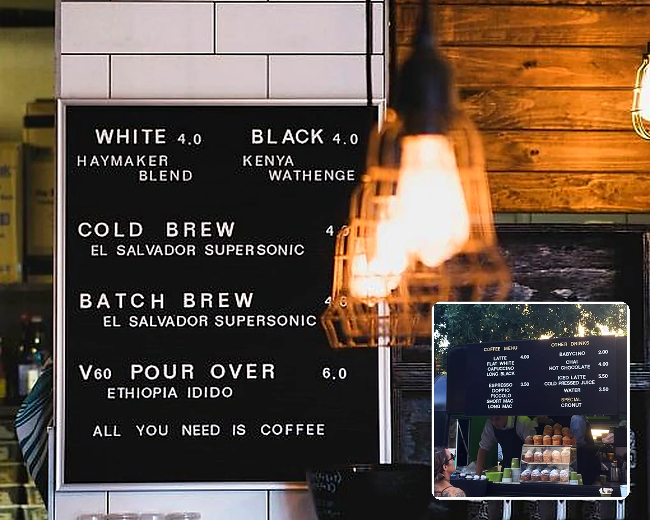
A felt café menu board can display:
• Coffee varieties
• Sizes
• Milk options
• Food items
• Prices
• Seasonal drinks
• Daily specials
A consistent letter format helps keep a busy menu structured.
Restaurants and Bars
Larger menu boards can separate:
• Food
• Wine
• Beer
• Cocktails
• Specials
• Service times
Consider using several boards where one display would become overcrowded.
Retail Stores
Changeable letter boards can present:
• Product pricing
• Promotions
• New arrivals
• Store information
• Event messages
• Collection points
Offices and Reception Areas
A letter board can display:
• Welcome messages
• Visitor directions
• Meeting information
• Staff announcements
• Event schedules
• Room availability
Schools and Education Facilities
Applications may include:
• Event details
• Performance schedules
• Reception notices
• Canteen menus
• School announcements
• Directional information
The same principles apply across each environment: concise wording, suitable character size, strong contrast and enough blank space to support quick reading.
15. Avoid Common Menu Board Buying Mistakes
Ordering Before Drafting the Menu
The board may be too small once headings, prices and spacing are included.
Choosing Letters That Are Too Small
Content may fit neatly but remain unreadable from the customer area.
Forgetting That Characters Are Sold Separately
Confirm what is included with the board and order compatible packs.
Underestimating Repeated Letters and Numbers
Menus can require several copies of common characters and price digits.
Filling Every Available Line
A crowded board is difficult to scan and update.
Choosing Colour Without Checking Contrast
The felt and character colours must remain readable under the venue’s actual lighting.
Installing the Board Too High
Staff need safe and comfortable access for updates.
Selecting Frameless Only for Appearance
Check mounting, wall condition and edge placement as well as visual style.
Using a Standard Size That Does Not Fit the Content
Custom sizing may provide better value than forcing an important menu into an unsuitable format.
Failing to Proofread
Incorrect prices and spelling errors can remain visible to every customer until corrected.
Final Menu Board Checklist
Before ordering, confirm:
• Primary use
• Complete menu or message
• Maximum number of lines
• Longest product name
• Required price format
• Normal viewing distance
• Character size
• Board width and height
• Portrait or landscape orientation
• Framed or frameless design
• Felt colour
• Character colour
• Standard or custom dimensions
• Number of letter packs
• Number of number packs
• Required punctuation and symbols
• Wall and mounting position
• Lighting and visibility
• Staff access for updates
• Character storage method
• Final proofreading process
Conclusion
The best menu board is one that presents the complete message clearly while remaining easy for staff to update.
A felt letter board suits cafés, restaurants, retail stores and workplaces that want uniform, reusable text without repeatedly printing new signage. A blackboard provides greater handwritten flexibility, while a framed display is more appropriate for largely permanent printed content.
Draft the longest realistic menu, calculate the required lines, test the character size from the normal viewing distance and confirm that sufficient letters and numbers are available. These steps will produce a menu display that remains practical as products, prices and messages change.
For exclusive educator discounts, visit our Education Hub!