A custom printed whiteboard works best when its permanent layout removes repetitive setup without restricting the information users need to add each day.
The strongest designs are built around a recurring workplace process rather than appearance alone. Headings, grids, workflow stages, maps and branding can be printed permanently, while names, dates, figures, comments and changing priorities remain writable.
Before ordering, define the board’s purpose, users, update frequency, viewing distance and required writing area. This helps create a practical communication tool rather than an attractive board that becomes too crowded or difficult to maintain.
1. Start With the Decision the Board Needs to Support
Do not begin by choosing colours, columns or a logo position. Begin with the recurring decision or activity the board needs to make easier.
A custom printed whiteboard may support:
• Staff rosters
• Weekly work schedules
• Project pipelines
• Production planning
• Sales tracking
• Key performance indicators
• Maintenance programs
• Safety communication
• Room or equipment status
• School timetables
• Training plans
• Property and site maps
• Sports coaching diagrams
• Resource allocation
• Meeting actions
Define the board’s primary task in one sentence.
For example:
• Show which projects are waiting, active or completed
• Display who is assigned to each shift
• Track weekly production priorities and issues
• Record monthly sales progress against targets
• Coordinate room bookings and equipment availability
• Keep maintenance tasks visible until completed
A clear purpose prevents the board from becoming a general collection of unrelated information.
The available printed whiteboards can support structured layouts for planning, scheduling, workflow tracking and repeat-use workplace communication.
2. Map the Workflow Before Designing the Layout
The printed layout should reflect how information actually moves through the organisation.
Speak with the people who will update, read and act on the board. Management may understand the reporting requirement, while daily users understand where delays, confusion and duplicated work occur.
Ask:
• Who updates the board?
• Who needs to read it?
• How often does information change?
• Which details remain visible for several days or weeks?
• Which information is removed after each shift or meeting?
• What action should occur after someone reads the board?
• Does the process move from left to right, top to bottom or by date?
• Are there existing forms or spreadsheets that define the workflow?
• Which information is frequently missed?
• Does any information require restricted access?
Sketch the proposed layout on paper before commissioning finished artwork.
A basic prototype can be tested using:
• A blank whiteboard
• Removable grid tape
• Printed paper headings
• Sticky notes
• A spreadsheet enlarged to the proposed proportions
• A temporary wall outline marked with painter’s tape
Use the prototype during a realistic work cycle. This can reveal columns that are too narrow, fields that are rarely used and information that needs more prominence.
A short testing period is usually more valuable than attempting to anticipate every requirement from a meeting-room discussion.
3. Decide What Should Be Printed Permanently
The permanent print should contain information that remains consistent throughout the life of the board.
Suitable permanent elements include:
• Column headings
• Row labels
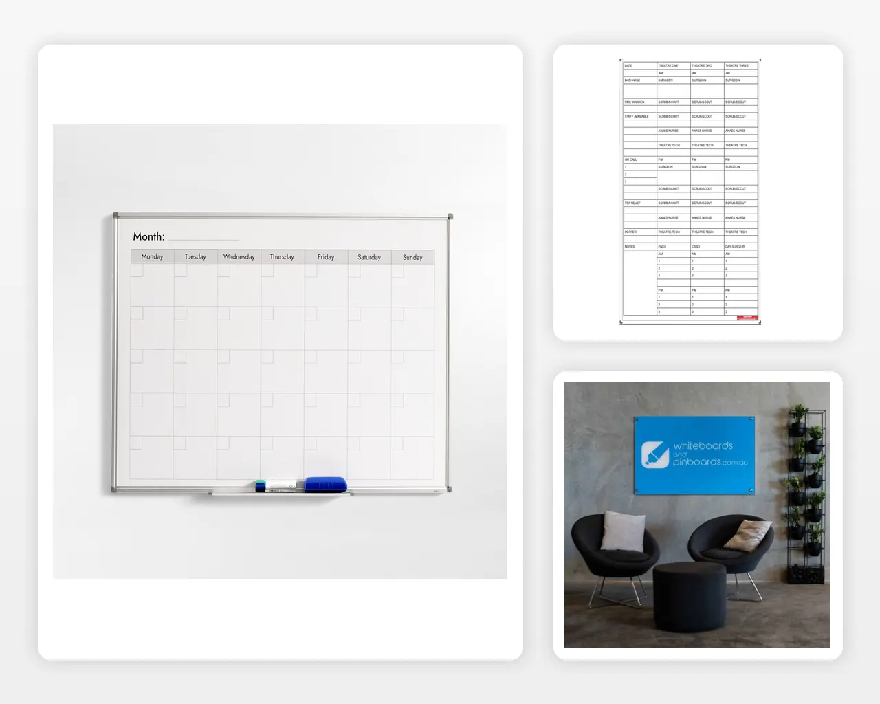
• Calendar grids
• Workflow stages
• Department names
• Maps and floor plans
• Safety categories
• Repeated instructions
• Measurement scales
• Company branding
• Colour-coded zones
• Reference diagrams
• Checklists
• Responsibility fields
• Standard meeting sections
Information that changes regularly should normally remain writable.
This may include:
• Employee names
• Dates and times
• Targets
• Current results
• Task descriptions
• Project status
• Customer details
• Comments
• Priorities
• Maintenance dates
• Room bookings
• Action owners
Printing too much information can make the board inflexible. Printing too little forces users to redraw the same structure every day.
A useful rule is:
Print the framework. Write the changing information.
Avoid permanently printing details that may change after a departmental restructure, software migration, policy update or change in reporting requirements.
4. Choose the Right Whiteboard Format
Custom printed boards are available in different surface and framing formats. The right option depends on frequency of use, presentation requirements, budget and surrounding environment.
Commercial Printed Whiteboards
A printed commercial whiteboard is a practical option for offices, schools, warehouses and operational areas.
It may suit:
• Rosters
• Workflow boards
• Production schedules
• Safety boards
• Project trackers
• Monthly planners
• Staff communication
• General workplace use
Magnetic functionality can also allow documents, status cards and compatible accessories to be attached to the surface.
Printed Glass Whiteboards
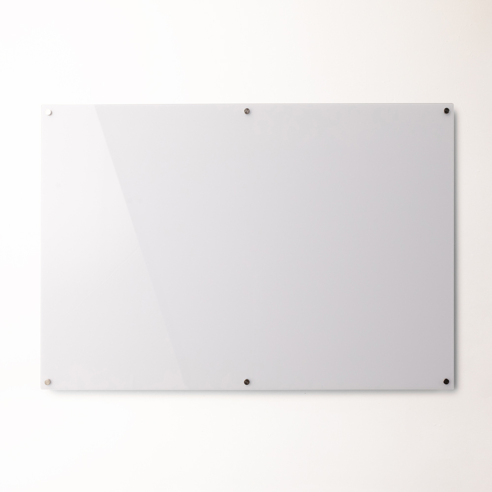
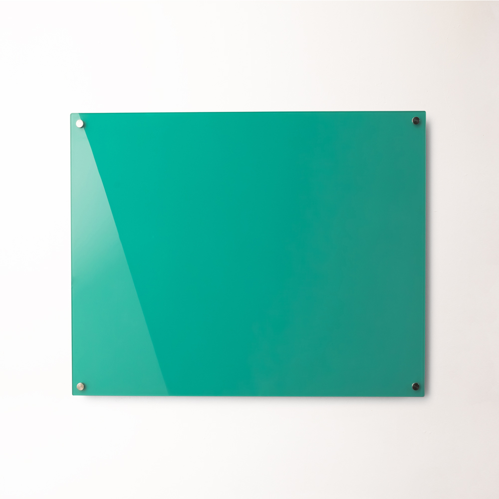
A printed glassboard can provide a more contemporary presentation for boardrooms, reception areas and client-facing workplaces.
Glass surfaces can suit:
• Corporate planning
• Branded presentation boards
• Premium meeting rooms
• Design studios
• Professional practices
• Long-term communication walls
Confirm magnetic requirements before purchasing accessories, as magnetic glassboards may require stronger magnets designed specifically for glass surfaces.
Standard or Custom Dimensions
A standard size may be appropriate when it provides enough writing area and fits the available wall.
A custom-sized board may be preferable when:
• The available wall has unusual dimensions
• The board must align with joinery
• Several boards need to form a coordinated display
• A long project timeline is required
• The layout contains many repeated fields
• The board must fit between doors, windows or equipment
• A specialised map or diagram determines the proportions
The custom whiteboard range can support workplaces where standard formats do not match the required dimensions or application.
5. Calculate the Required Writing Area
The board should be sized around the amount of changing information users need to enter, not simply the available wall.
Estimate the space required for:
• Normal handwriting size
• Long names or task descriptions
• Multiple entries within one field
• Magnetic documents
• Status cards
• Comments and exceptions
• Information retained from earlier periods
• Several people writing simultaneously
A narrow column may look neat in a digital design but become unusable when staff need to enter full names, detailed actions or multi-digit figures.
Test representative content inside the proposed fields.
For example, do not test a roster column using the name “Sam” when it may need to hold longer employee names, shift details and leave notes.
Also consider viewing distance. A board used by one person at close range can contain smaller fields than a production board viewed from across a warehouse or a classroom board read from the back of the room.
Measure:
• Clear wall width
• Clear wall height
• Furthest viewing distance
• Comfortable writing height
• Furniture below the board
• Nearby screens and equipment
• Door and window clearance
• Delivery and installation access
Do not place important fields so high or low that users avoid updating them.
6. Create a Clear Information Hierarchy
The board should communicate its structure within a few seconds.
Users need to recognise:
• What the board is for
• Where to enter information
• Which sections are most important
• How information moves through the layout
• What requires attention
• Who is responsible for updating it
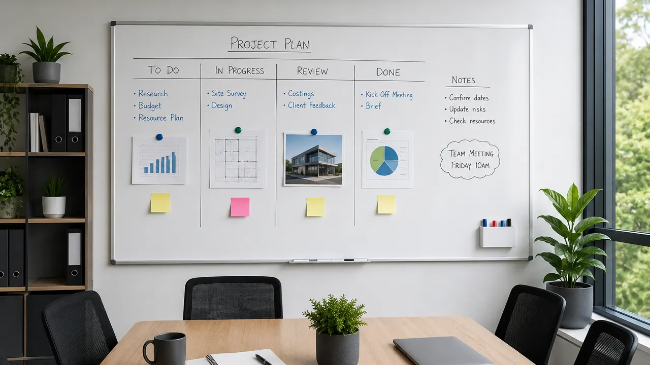
A practical hierarchy may include:
Primary Heading
Use a short title that explains the board’s purpose, such as:
• Weekly Production Plan
• Project Status
• Staff Roster
• Maintenance Schedule
• Sales Pipeline
• Safety Actions
Major Sections
Divide the board into the main categories users need to scan.
These may be:
• Planned
• In Progress
• Awaiting Review
• Completed
Or:
• Monday through Friday
• Morning and afternoon
• Team or department
• Daily, weekly and monthly actions
Entry Fields
Provide enough space for the information users will actually write.
Secondary Information
Instructions, dates, update responsibility and meeting details should remain visible without competing with the main content.
Use line weight, spacing and restrained colour changes to separate sections. Avoid relying on colour alone where headings or borders can provide clearer structure.
7. Use Colour Without Reducing Readability
Colour can improve scanning and reinforce branding, but excessive colour can make handwritten content difficult to read.
Use colour to:
• Separate major sections
• Highlight priority fields
• Identify departments
• Distinguish workflow stages
• Reinforce recurring categories
• Apply restrained brand styling
Avoid:
• Dark backgrounds across large writing areas
• Highly saturated fields behind marker writing
• Too many unrelated colours
• Low-contrast headings
• Decorative gradients behind operational information
• Colour combinations that are difficult to distinguish
• Large blocks of branding that reduce usable space
Most writable areas should remain light enough for standard marker colours to remain clear.
Where status is communicated through colour, include a written label or another visual indicator. This makes the board easier to interpret and reduces reliance on colour alone.
Test the design using the marker colours the workplace normally uses. A layout viewed on a bright computer monitor may appear different once printed and installed under office, classroom or warehouse lighting.
8. Keep Branding Proportionate to the Board’s Purpose
A company logo can make a custom whiteboard feel integrated with the workplace, but branding should not dominate an operational tool.
Brand elements may include:
• Company logo
• Brand colours
• Department name
• Site name
• Approved icons
• Corporate typography
• A short instruction or value statement
Position the logo where it remains visible without occupying the board’s most useful writing area.
A large decorative logo may be appropriate for a reception display, but a production or staff scheduling board should prioritise clarity and capacity.
Before approving the artwork, confirm:
• The logo file is current
• The colours match approved brand values
• The logo has enough clear space
• The design remains legible from normal viewing positions
• Branding does not compete with headings
• The board still provides enough writable area
Where the board may remain in use for many years, avoid campaign slogans, temporary messaging or departmental names that are likely to change.
9. Plan Magnetic Documents and Accessories
When the selected board has a magnetic surface, the layout should account for the items that may be attached.
These could include:
• Work orders
• Printed reports
• Photographs
• Magnetic task cards
• Staff name labels
• Status indicators
• Safety notices
• Magnetic document holders
• Marker holders
• Erasers
Attached documents can cover printed fields and reduce available writing space. Identify where these materials will sit before finalising the design.
A dedicated document area may be better than allowing papers to accumulate across the entire board.
Also determine:
• Which markers will be used
• Where markers will be stored
• Whether an eraser or cleaning cloth needs a fixed location
• Which magnets suit the surface
• Whether magnetic labels need standard dimensions
• How outdated information will be removed
• Who is responsible for board maintenance
The Custom Printed Standard Commercial Whiteboard provides an example of a made-to-order magnetic writing surface that can incorporate a supplied layout or design.
10. Prepare Accurate Artwork and Instructions
Clear instructions reduce revision time and minimise the risk of an unsuitable final layout.
Provide:
• Exact board dimensions
• Landscape or portrait orientation
• Required headings
• Correct spelling and terminology
• Original logo files where available
• High-resolution images
• Brand colour references
• Examples of existing forms or workflows
• A sketch showing preferred section positions
• Notes explaining what users will write in each field
Avoid supplying only a low-resolution screenshot when original artwork or editable files are available.
The designer needs to understand the board’s function, not just its appearance. Explain how information moves through the layout and identify the sections that require the most writing space.
Where several stakeholders are involved, appoint one person to consolidate feedback. Conflicting instructions from different departments can result in repeated revisions and an unnecessarily complex design.
11. Review the Design Proof Carefully
A proof should be reviewed as a working tool, not merely as a visual design.
Check:
• Overall dimensions
• Orientation
• Heading spelling
• Department and employee terminology
• Logo accuracy
• Grid alignment
• Column widths
• Row heights
• Colour contrast
• Writing-space proportions
• Field order
• Date formats
• Instructions
• Borders and dividing lines
• Areas reserved for magnetic documents
Print the proof at a reduced scale or display it on a wall where several users can review it.
Ask typical users to imagine completing a normal update.
Can they immediately identify where to enter:
• A long project name?
• A delayed task?
• A staff absence?
• An unexpected issue?
• A result that exceeds the field width?
• A comment that needs to remain visible?
Changes should be made before production. Once the permanent layout is manufactured, moving a column or correcting a heading may require replacing the board.
12. Avoid Common Custom Whiteboard Design Mistakes
Creating Too Many Sections
A board divided into numerous small boxes may look organised but provide insufficient writing space.
Designing for Ideal Information
Real entries are often longer and less predictable than sample text. Test difficult examples.
Printing Information That Changes
Roles, team names, targets and procedures may become outdated. Keep variable content writable.
Using Low-Contrast Colours
Light marker colours can disappear against coloured backgrounds, while dark backgrounds may require specialist markers.
Making the Logo Too Large
Branding should support the board rather than reduce its practical value.
Ignoring Viewing Distance
Small headings and fields may work on a computer screen but fail when viewed across a room.
Forgetting Magnetic Documents
Attached papers and cards can cover important printed sections.
Copying an Existing Spreadsheet Exactly
A spreadsheet designed for a computer screen may contain too many columns and details for a wall-mounted board.
Skipping User Testing
The people updating the board may identify practical problems that managers or designers overlook.
Approving Without Checking Spelling
Permanent printed headings should be reviewed by more than one person before manufacture.
Final Custom Printed Whiteboard Checklist
Before approving the order, confirm:
• The board has one clearly defined primary purpose
• Daily users have reviewed the proposed layout
• Permanent and changing information are separated
• The writing fields accommodate realistic entries
• The size suits the viewing distance
• The full board remains reachable
• The surface suits the expected usage
• Magnetic requirements are confirmed
• Colours provide sufficient contrast
• Branding remains proportionate
• Current logo files have been supplied
• Headings and terminology are correct
• The layout has been tested before manufacture
• Delivery and installation access have been measured
• One person is responsible for final approval
• The completed proof has been checked carefully
Conclusion
A successful custom printed whiteboard should make a recurring process faster, clearer and easier to manage.
Start with the workplace decision the board needs to support. Map the actual workflow, test the structure with realistic information and print only the elements that remain consistent. Leave enough clear writing space for the names, dates, figures and exceptions that change throughout normal use.
The strongest layouts use clear headings, practical field sizes, restrained colour and proportionate branding. Careful proof review before manufacture helps ensure the finished board remains useful long after installation.
For exclusive educator discounts, visit our Education Hub!